What Your Bokeh Is Actually Saying: The Emotional Language of Out-of-Focus Color

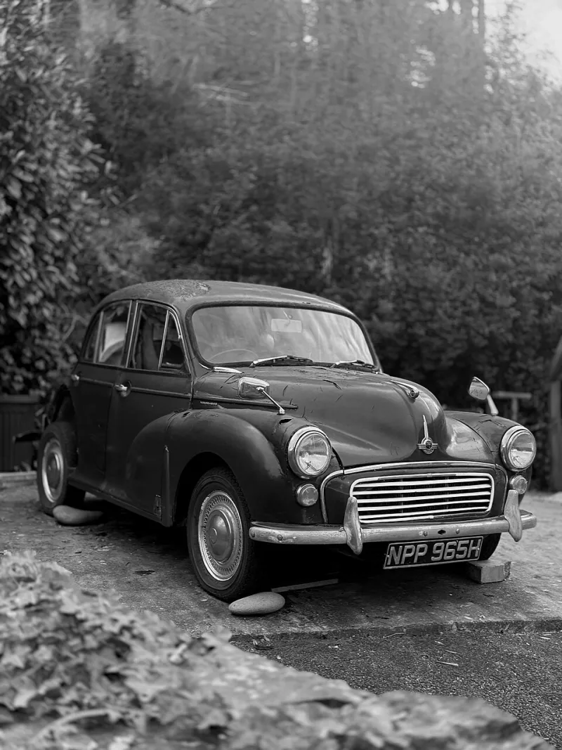
Photo: Pattaya Patrol from Pattaya, CC BY-SA 4.0, via Wikimedia Commons
There's a moment every photographer knows — the one where you nail focus on your subject and the background just dissolves into these gorgeous, glowing orbs of light. It feels almost accidental at first. Lucky, even. But the photographers, directors, and visual artists who are doing the most interesting work right now? They're not stumbling into those colors. They're choosing them the way a painter chooses a palette.
Bokeh color isn't decoration. It's dialogue.
The Psychology Behind the Blur
Before we get into technique, let's talk about why this even matters. Human beings are wired to respond emotionally to color — that's not a photography concept, that's neuroscience. What makes bokeh particularly powerful is that the soft, undefined nature of out-of-focus light actually amplifies emotional response. When your brain can't fully process a shape, it leans harder into feeling. The color does more of the heavy lifting precisely because the detail is gone.
That's the secret weapon here. A sharp neon sign in the background is just set dressing. The same sign rendered as a soft magenta bloom behind your subject? Now it's a mood. Now it's a statement.
Tungsten: The Original Nostalgia Machine
Warm amber bokeh — the kind you get from incandescent bulbs, candles, and old tungsten stage lighting — is probably the most emotionally loaded color in the photographer's toolkit. It reads as intimate. Safe. A little melancholy, if you push it far enough.
There's a reason so many indie film directors still reach for practical tungsten sources even when LEDs would be cheaper and easier. Think about the visual language of something like Moonlight or countless A24 productions — that amber glow isn't accidental. It's a deliberate signal to the audience that they're in emotionally vulnerable territory.
For portrait photographers, shooting in environments with warm practical lights — think dive bars, vintage diners, old theaters — gives you bokeh that feels like a memory before you've even processed the file. If your work leans toward storytelling portraiture or editorial fashion with a nostalgic bent, tungsten bokeh is your native language.
LED and Fluorescent: Cold Truths and Urban Anxiety
On the opposite end of the spectrum, modern LED and fluorescent sources produce bokeh in cooler, flatter tones — blue-whites, clinical greens, that particular shade of pale cyan that haunts every gas station and parking garage in America.
This is the color of unease. Of systems and surveillance. Of being very small in a very large place.
Fashion photographers working in an editorial space that wants to feel current, even slightly dystopian, have been leaning into this hard. Shooting in warehouse spaces, under industrial fluorescents, or in the glow of commercial signage creates a bokeh palette that feels genuinely contemporary — not warm, not comforting, but alive in a different way. It's alert. It's electric.
Music video directors have been especially smart about this. The visual language of a lot of hyperpop and post-internet aesthetics leans directly into LED-sourced bokeh — that cold, slightly unreal glow that makes everything look like it's happening inside a screen.
Neon: When Bokeh Becomes Pure Emotion
Neon is its own category entirely, and honestly it deserves its own article. The colors that neon produces when thrown out of focus — deep magentas, electric blues, saturated reds and greens — are almost aggressively emotional. They don't suggest a feeling. They insist on one.
The interesting thing about neon bokeh is how much the specific color combination matters. Red and blue neon together reads as tension, maybe danger — it's the palette of late-night streets and noir storytelling. Pink and purple neon is more romantic, more dreamy, with a retro-futurist quality that fashion and beauty photographers have been running with for years now.
If you're shooting in a city with any kind of nightlife district, you're sitting on a gold mine. The challenge isn't finding neon sources — it's being intentional about which neon sources you position in your frame and how far back you push them to control the size and softness of those bokeh orbs.
Natural Light: The Subtle Master
Natural light bokeh is the quiet one in the room, and it's often underestimated. The soft gold of late afternoon sun hitting leaves creates bokeh that's warm but not heavy — lighter and more delicate than tungsten, with a quality that reads as genuine and unforced. Magic hour bokeh is essentially shorthand for hope.
Conversely, overcast natural light produces bokeh in cool, desaturated tones — soft grays and pale whites that can feel serene or lonely depending on everything else going on in the frame. Wedding photographers know this intuitively. So do outdoor portrait shooters who've learned to use the direction and color temperature of natural light as a storytelling tool as much as a technical consideration.
Making It Intentional: A Practical Framework
So how do you move from understanding this to actually using it? A few things worth building into your pre-shoot thinking:
Scout for color, not just light. When you're walking a location, look at the background light sources with your eyes slightly unfocused. Roughly simulate what those lights will look like as bokeh. What colors are dominant? What emotional register are they in?
Match or contrast deliberately. Warm bokeh behind a cool-toned subject creates tension and separation. Warm bokeh behind a warm subject feels cohesive and safe. Neither is wrong — but you should be choosing, not just accepting.
Use white balance as a color tool. Shifting your white balance warmer or cooler will affect your bokeh color along with everything else in the frame. This is especially useful when you want to push a natural light situation toward a more specific emotional tone.
Don't over-correct in post. One of the most common mistakes is shooting in a location with genuinely interesting bokeh color and then neutralizing it during editing because it looks "off." Fight that instinct. The weirdness is often the point.
The Frame Behind the Frame
At the end of the day, bokeh isn't just a technical byproduct of shooting wide open. It's the emotional atmosphere your subject lives inside. The colors swimming in that soft background space are setting a tone, whispering a context, telling the viewer how to feel before they've even fully registered your subject.
The photographers and filmmakers doing the most compelling visual work right now understand this. They're not just managing bokeh — they're composing it. They're treating the blur as a canvas.
You should be too.